Media evaluation Annie Meehan
We began looking at popular drug sites and seeing the key points they made and there layouts. We tried to follow the same pattern but also make it are own by changing how some of it was laid out. We looked at the colours that they had used, some websites had kept the colours minimal but others like “ FRANK” were bright and vibrant. We liked the effect the colours had so we made our site similar, in the way it had very bright colours. We made an a-z page of drugs are first thoughts were to make a drop down making it less messy and yes to see, but then looking at other sites a lot had also done this, so we tried just writing the drugs as bullet points next to the letters. This work well as we used vibrant colours and was neat and easy to read for the audience.

 By looking at these sites we could see who our target market was, we had to aim our site at teenagers and young adults who wanted to find help and people who wanted information on drugs. We asked people what questions they wanted to ask and find out about, and also looked on the other sites and could see what people wanted to know. (E.g. what actually happens when you take drugs?) We chose to do a drug site as it affects all genders and ages. Even though we are aiming are site at everyone we settle for a young adult teenage age group as they are faced with new things and don’t know all the sides to drugs and what can happen.
 We choose the pictures for our site to show the reality of drugs and realism of the substances. What they can cause and do to people. We made them as realistic as we could so people would know what they looked like. We chose fonts that where easy to read but also attracted people, it was a type of scripture font, which went well giving off a certain vibe. We called our site “drug rehab” as in the name people already know it’s a helping site.
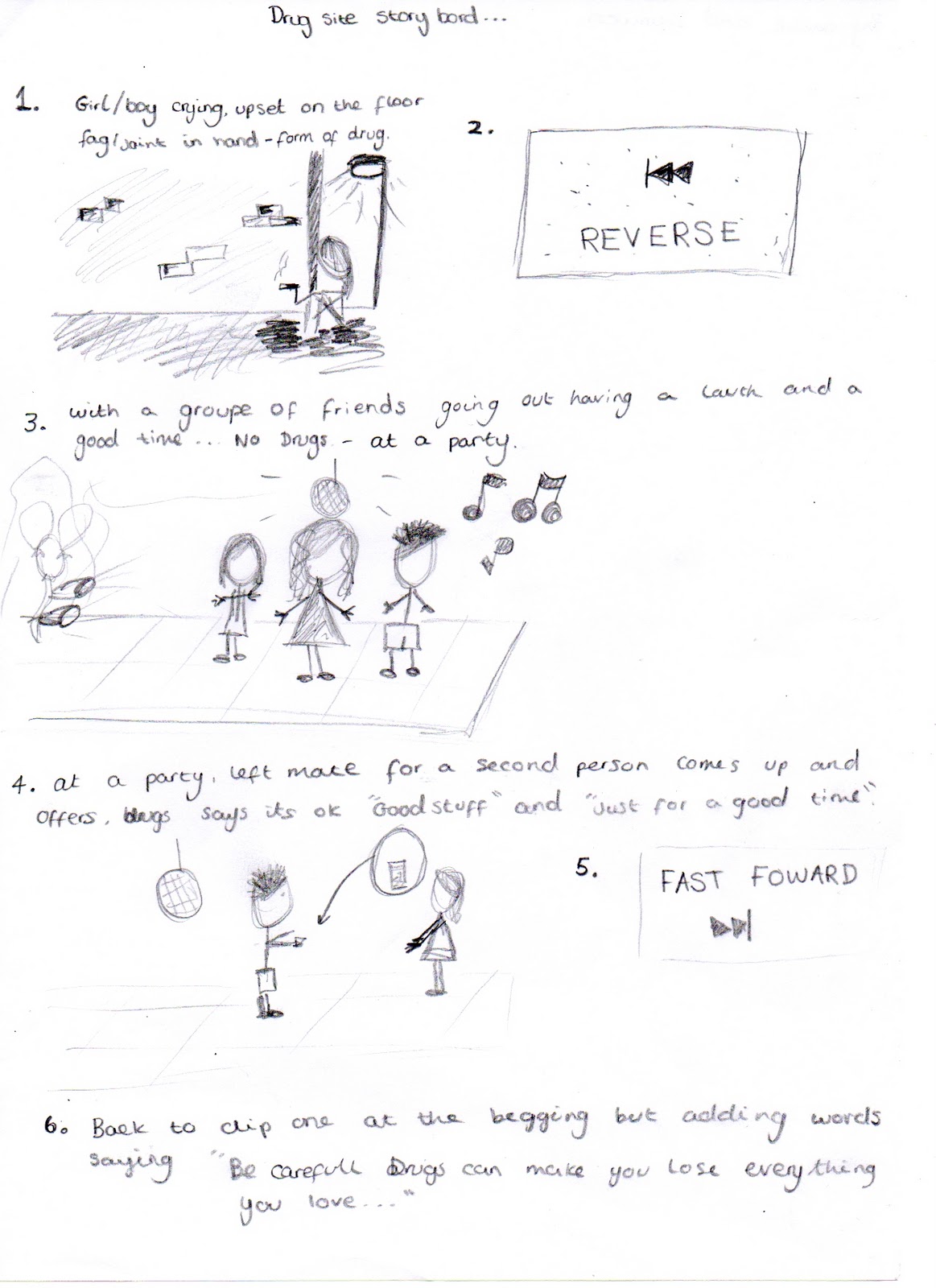
 We also saw that people had made small videos on their sites. We also created a short film about drugs to show people what can happen to their lives. We made the film too long therefore people lost interest. We edited the film and made it shorter but overall it is still long. We changed the layout and made it a film like they would on TV to show the harsh realities and emotions of the people. Unlike other sites they just had written stories from people. Sites also had interviews of people and their experiences of drugs. To make people attracted to our site we used colours, fonts, videos, and pictures. We made our video so we could relate to people more and had a questions and answers page to make people feel comfortable and show that they weren’t allow. We used the langue we used so people could understand and follow.
 The site will make the audience more aware of the side effects of drugs and harm they can cause to their bodies. We made the site unisex so it will apply to all genders. The site is aimed at teenagers and young adults, its straight forward and to the point because of this, it is seen as informal. We made the links different colours so when someone rolls over it the colour becomes more vibrant, some sites have also done this as it make the person want to enter that page as the word then stands out. The layout is straight forward and the information is all in separate boxes as when looking at some sites it was hard to see parts of information as they started talking about other subjects straight after making it confusing for people. Also putting the information in boxes people don’t have to read everything they can just look up certain parts.
 We made a preliminary website for a school and the layout for that comparing to our drug site is different in the fact are drug site is more organised layout and is seen in a more professional way. We learnt how to make a roll over and hyperlinks to other sites; by making the preliminary site it allowed me to learn how to use iweb and also Photoshop allowing me to develop my skills. This also allowed us to learn how to make videos for our sites. The colours changed from how we made our two sites and on the second site they went together better, as we learnt about the colour wheel and what colours worked tighter well on websites. The beginning of the task I struggle in making the site as I had too learn everything but over time I learnt new things and began to push myself to make the site better and challenge myself. I also struggled in Photoshop but have learnt how to use it better and “final cut” but I learnt new skills and made and edited my video for the site.
 Looking back the preliminary site was for our own enjoyment and we made it in the way it would appeal to us. We didn’t think of target audience or the layout to show the information, where as the second site, we focuses on these points, who we were targeting, and what attracts them to our site? I also feel we became more confident in the soft wear and challenged ourselves into making things look better. After the whole course my skills have improved and my attitude to layouts and websites have change. I think that you can use the improvement of the sites in the videos as I have added fades and slow motions in the drug site where as the preliminary site just had font at the begging.